Welcome to Royal Queen Seeds. Yes, it’s us. We have changed a bit. But trust us—it’s for the best!
If something works, don’t touch it.
– I like the gothic typography, like a character from the north, a brand very old, that has always been present. The thick black and the lion. It is so smart, for it to smoke a joint. Well thought.
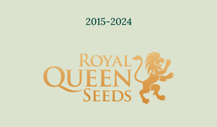
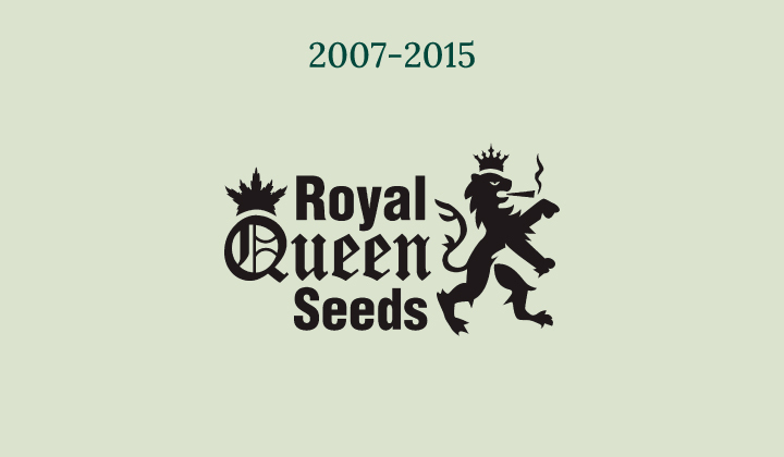
We thought we needed an upgrade. It was an amazing process––and also gave us some “vertigo” to see how far we’ve come already. Fortunately, we were all united in this journey.
We understand that change is hard at the beginning. Change is intimidating, and can have you thinking: are the same people working there? Are they offering the same seeds? Can I still trust them?
Yes, yes, and yes!
It’s simply that, in the last few years, we have been moving. Fast. There are moments in your life when things start to speed up. Phases where exciting opportunities arise, and you have to take them. Among other milestones, we arrived in the US and unveiled the first F1 hybrid cannabis seeds to the world. Furthermore, we continue to explore new collaborations, and are pushing the boundaries to develop the latest and trendiest genetics. Remember Tropical Mirage? A variety that boosts creativity…
That brings us here again, to creativity. And opportunity.
We present you with us—the new Royal Queen Seeds. Nice to meet you.
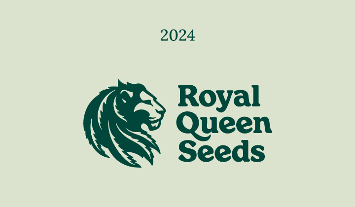
The Lion
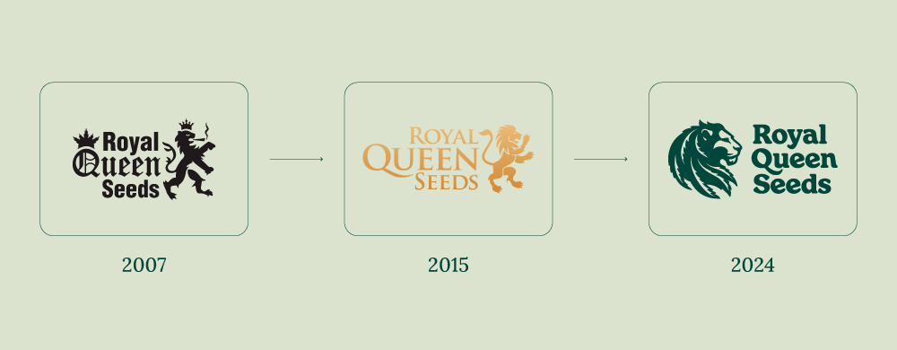
The lion was getting older. We loved him, of course. It’s still in our DNA. It’s Dutch, it’s brave, it’s powerful, and dynamic. In terms of Royal, he is untouchable and non-negotiable.
But having a lion in a logo is also insanely popular.
In a digital world with hundreds of thousands of brands, many of them known worldwide, there are thousands of lions. Do the test and check online. Although ours was unique, we always felt it was a bit odd. Too ferocious, maybe? We thought, why not twist it?
But how?
We decided to give him more emphasis. Instead of his body, we focused on his head so we could see his expression better.
The new lion is strong. He is also patient, and wise. He is brave, but still kind and relatable. Importantly, he is easily recognisable. And above all, he is unique.
It was a challenge bringing him to life. We had to imagine him from scratch. A lot of our options were beautiful, but they were a bit too fierce, a bit too casual, a bit too severe or distant. We needed to focus on his expression. More patient. More calm. Not so young anymore. Still bold and fast, but more mature and respectful. An ally in the process of growing, if you want to encompass it all.


The Typeface
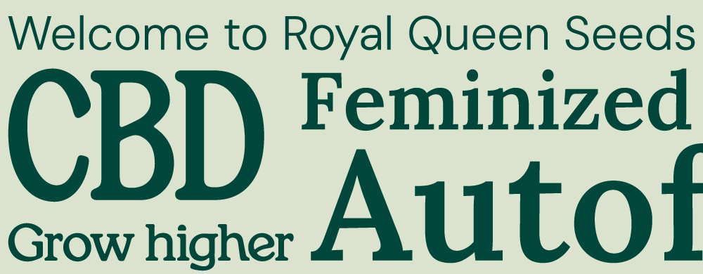
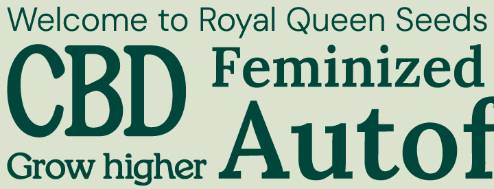
Well, we had an issue with the typeface. Remember why you liked “Queen” so much? It may sound familiar for a reason. Above all, there was emphasis on “Queen”, for no apparent reason. “Royal” and “Seeds” are equally important. Nobody knows us as “Queen”. We were lacking balance.
In addition, the typeface––although beautiful and elegant––conveyed expertise, but in a cold way. It wasn't grounded or organic, and not close to you.
In choosing a new typeface for the logo, we wanted to emphasize the organic nature of the product, our environment, and our day-to-day—a weighty typeface that is playful and relatable, thicker, and more visible, allowing us new ways to connect.
This typeface will also be used on our site and in our communications. It will help us to reveal what’s important, in an organic, functional, and modern way.
RQS –– Back to the Source
Many of you also know us as RQS. We understand. Royal Queen Seeds is a long name to spell (and articulate). Using only “Royal” doesn’t clarify much; besides, it loses our main purpose: “Seeds”.
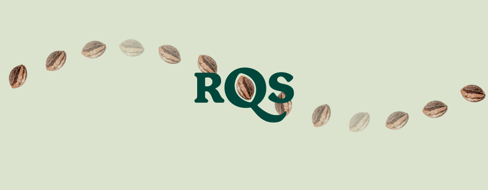
So, as we did in the past, we explored an “RQS” design that would summarise our name and allow us to employ it in shorter messages.
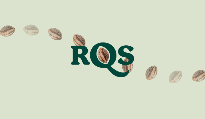
But when doing so, we discovered something. That space in the Q, and the tail… looks familiar. It is the core of the letter, the core of the name, and also the core of our essence. The Q holds a seed in it. That’s just perfect, isn't it? Did you notice? Be honest!
The Colors
Ah yes, the colors. Although very recognisable, they were also quite hard to work with. You may have noticed that they could attract lots of attention, but at the same time, they also exhausted the eye quickly. And besides those formal reasons, they conveyed (shouted) a message that no longer represented us.
Color is very important. Think about your clothing, or the colors of your walls at home, your car, or the tone of your favorite movies.
Every color has something to say—its saturation, its hue, and the combination of these communicates a message.
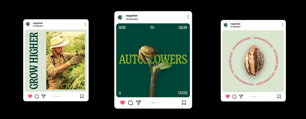
We thought that, besides the logo and typography, colors were something to improve upon. As you may have noticed, we have refined them. We transitioned to more basic colors, closer to organic tones, bringing a sense of calm and serenity; above all, they combine nicely!
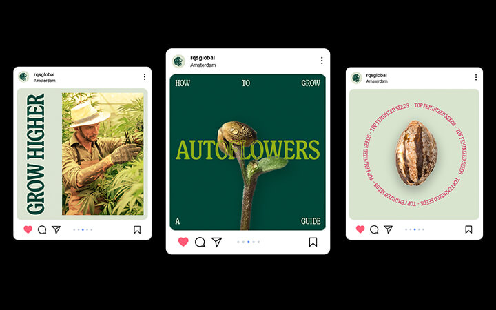
A new world full of possibilities just opened before our eyes. We are already thinking about how we can use them: in packaging, on our website, SM channels, and… our merchandising!
We can’t wait to create a new line of apparel and share it with you, plus all the gear that we will prepare in the following months!
The Message
Since the beginning, our goal has been to learn and share our experience with our community. Growing any plant from seed is not easy (although with the proper information and guidance, it feels so).
Being positive and bold, we aspired to "Keep on Growing". Growing more leads to deeper knowledge of the process, gradually converting newbies to experts. Essentially, the simple reminder of "Keep on Growing" naturally leads to evolving personally.
A few years ago we introduced "Growing, Together" as an alternative motto. It was an emotional next step in our relationship. We felt that we were learning from our thriving community, as you learned from us.
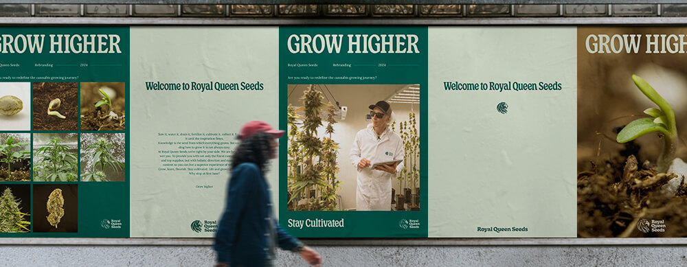
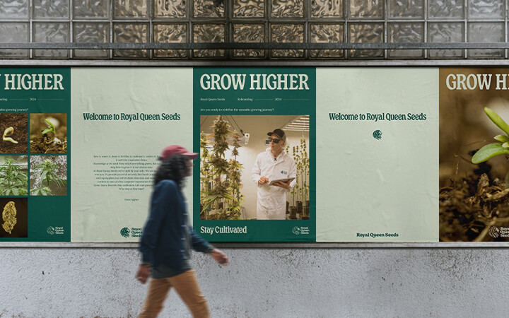
Today, while the cannabis world around us is transforming so quickly, and everything is exciting, we feel we need to evolve. Transitioning to this new vision is an opportunity to push things further. Actively. Together. Bolder. Higher. See the implications? Are you with us?
A note on the packaging
As you can imagine, transitioning from a well-established brand to a new image is a process that requires some time. You may still come across our old logo here and there, but rest assured, it's still us. To ensure the sustainability of this transition – a core value for us – we will continue using our current packaging until its completion before fully embracing the new image.
This doesn't imply your seeds are old! Instead, it comes from a strategic decision deriving from a large order we placed. We are committed to minimizing waste and being eco-conscious, and discarding perfectly good packaging goes against this principle.
From Our Origins to Today, "We" Are in First Place
Being on this journey together has been the most exciting. But there is still a lot to do. We still need to evolve our society and empower every grower to be more knowledgeable, sustainable, and self-sufficient. We need passionate and qualified individuals to help us spread this message, so we can all grow higher than we ever thought possible.


